Level:
Correct: 0
Incorrect: 0
Marks: 0/0
Exam Practice
Subject:
Topics:
Edexcel GCSE Maths (Non-calculator) Smart practice A mixed round aimed at your weak spots
Unit 1
Number
Unit 2
Algebra
Unit 3
Ratio, proportion and rates of change
Unit 4
Geometry and measures
Unit 5
Probability
Unit 6
Statistics
Avg
score:
–
Topics
done:
0/97

Scatter graphs and correlation

Practise 28 exam-style questions on Scatter graphs and correlation for Edexcel GCSE Maths (Non-calculator). Write your answer as you would in the exam and get it marked in seconds against the mark scheme, point by point, with an AI tutor on hand if you get stuck.

  • 28 questions
  • 1–5 marks each
  • Instant marking
  • No sign-up needed
20 questions, marked as you go

Sample questions with model answers

Here are 4 of the questions in this topic, each with a model answer, an explanation of why it earns the marks and the mark scheme an examiner would use.

Question 1

2 marks

The scatter graph shows the shoe sizes and the maths test marks of some students.

Ben says,
"Students with bigger feet get higher marks in maths tests."

Describe the correlation shown by the scatter graph, and explain whether it supports what Ben says.
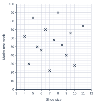
Scatter graph on a grid of small squares. The horizontal axis is "Shoe size", from 3 to 12, numbered every 1, with 2 small squares between numbered values (each small square is 0.5). The vertical axis is "Maths test mark", from 0 to 100, numbered every 10, with 5 small squares between numbered values (each small square is 2). 14 points are plotted as crosses: (4, 62), (4.5, 30), (5, 84), (6, 46), (6.5, 70), (7, 22), (7.5, 58), (8, 90), (9, 40), (9.5, 66), (10, 28), (11, 74), (5.5, 50) and (8.5, 52).

Model answer

The scatter graph shows no correlation: the points are scattered with no pattern.
This does not support Ben's statement: students with bigger feet are not more likely to get higher marks.

Explanation

When the points are spread all over the graph with no upward or downward trend, there is no correlation, so knowing one variable tells you nothing about the other.

Mark scheme
  1. 1 mark

    B1 for no correlation

  2. 1 mark

    C1 for No, it does not support Ben, e.g. there is no relationship between shoe size and maths mark
Question 2

2 marks

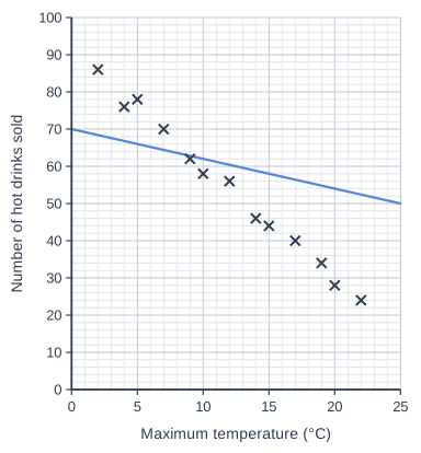
The scatter graph shows the maximum temperature and the number of hot drinks sold by a café on each of 13 days.
Tom has drawn a line of best fit on the scatter graph.

Give two reasons why Tom's line is not a good line of best fit.

Scatter graph on a grid of small squares. The horizontal axis is "Maximum temperature (°C)", from 0 to 25, numbered every 5, with 5 small squares between numbered values (each small square is 1). The vertical axis is "Number of hot drinks sold", from 0 to 100, numbered every 10, with 5 small squares between numbered values (each small square is 2). 13 points are plotted as crosses: (2, 86), (4, 76), (5, 78), (7, 70), (9, 62), (10, 58), (12, 56), (14, 46), (15, 44), (17, 40), (19, 34), (20, 28) and (22, 24). A straight line of best fit is drawn; it passes through (0, 70) and (25, 50).

Model answer

1. The line is not steep enough, so it does not follow the downward trend of the points.
2. The points are not balanced either side of the line: for low temperatures all the points are above the line, and for high temperatures all the points are below it.

Explanation

A good line of best fit follows the direction of the points and has roughly the same number of points on each side along its whole length. It should pass close to the mean point of the data.

Mark scheme
  1. 1 mark

    C1 for one correct reason, e.g. it does not follow the trend of the points (it is not steep enough)

    correct answer with no working scores full marks

  2. 1 mark

    C1 for a second correct reason, e.g. the points are not spread evenly either side of the line: on the left most points are above it and on the right most points are below it

    accept 'it does not pass through the middle of the points' or 'it does not go near the mean point (12, 54)'

Question 3

3 marks

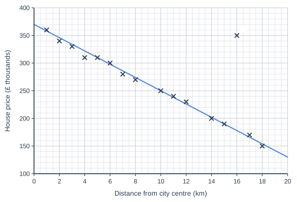
The scatter graph shows the distance from the city centre and the price of some houses in a city. A line of best fit has been drawn. The point P is an outlier.

Write down the coordinates of P.
Suggest a reason why this house might not fit the pattern.
Use the line of best fit to estimate the price you would expect for a house at the same distance from the city centre as P.

Scatter graph on a grid of small squares. The horizontal axis is "Distance from city centre (km)", from 0 to 20, numbered every 2, with 4 small squares between numbered values (each small square is 0.5). The vertical axis is "House price (£ thousands)", from 100 to 400, numbered every 50, with 5 small squares between numbered values (each small square is 10). 16 points are plotted as crosses: (1, 360), (2, 340), (3, 330), (4, 310), (5, 310), (6, 300), (7, 280), (8, 270), (10, 250), (11, 240), (12, 230), (14, 200), (15, 190), (17, 170) and (18, 150), plus a point labelled P. (The labelled point's coordinates can be read from the grid.) A straight line of best fit is drawn; it passes through (0, 370) and (20, 130).

Model answer

P is at (16, 350): a house 16 km from the centre costing £350 000.
It might be a much larger house than the others (for example with more bedrooms or a lot of land).
The line of best fit at 16 km gives about 178, so the expected price is about £178 000.

Explanation

An outlier does not follow the general trend. In real data there is often a reason, such as a house being much bigger. The line of best fit shows what the trend predicts, which is much lower than P's actual price.

Mark scheme
  1. 1 mark

    B1 for (16, 350)

    correct answer with no working scores full marks

  2. 1 mark

    C1 for a sensible reason, e.g. it is a much bigger house, or has more land, or is a special type of property

  3. 1 mark

    B1 for an answer in the range £170 000 to £185 000

    line value at 16 km is 178 (£ thousands)

Question 4

4 marks

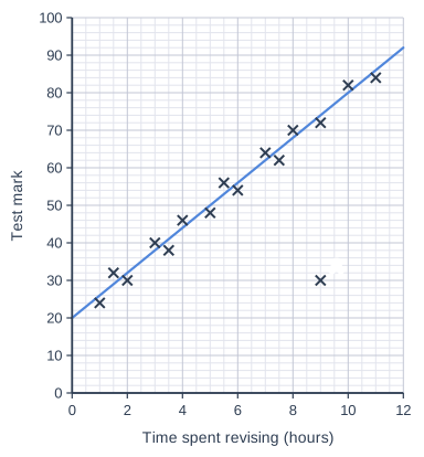
The scatter graph shows the time spent revising and the test mark for each of 16 students. A line of best fit has been drawn. The point A is an outlier.
The pass mark for the test is 50.

Use the line of best fit to estimate the least time a student needs to revise to pass the test.
How many of the students who revised for longer than this time did not pass the test?

Scatter graph on a grid of small squares. The horizontal axis is "Time spent revising (hours)", from 0 to 12, numbered every 2, with 4 small squares between numbered values (each small square is 0.5). The vertical axis is "Test mark", from 0 to 100, numbered every 10, with 5 small squares between numbered values (each small square is 2). 16 points are plotted as crosses: (1, 24), (1.5, 32), (2, 30), (3, 40), (3.5, 38), (4, 46), (5, 48), (5.5, 56), (6, 54), (7, 64), (7.5, 62), (8, 70), (9, 72), (10, 82) and (11, 84), plus (9, 30) labelled A. A straight line of best fit is drawn; it passes through (0, 20) and (12, 92).

Model answer

Going across from 50 on the vertical axis to the line of best fit and down gives 5 hours.
The students who revised for more than 5 hours are the points at 5.5, 6, 7, 7.5, 8, 9, 9, 10 and 11 hours. Only one of these, A at (9, 30), has a mark below 50.
So 1 student did not pass.

Explanation

Reading backwards from a mark to the line gives the revision time the trend predicts for that mark. The line describes the typical pattern, but individual students (like the outlier A) can still be far from it.

Mark scheme
  1. 1 mark

    M1 for using the line of best fit at a mark of 50

    or solving \(6x + 20 = 50\); correct answer with no working scores full marks

  2. 1 mark

    A1 for 5 hours

    accept 4.8 to 5.2

  3. 1 mark

    M1 for considering the points to the right of their time and below a mark of 50

  4. 1 mark

    A1 for 1

    the outlier A at (9, 30)

Ready to try the rest? Every answer you write is marked against the mark scheme, so you can see exactly where the marks are.

AI Tutor Hints first, answers after you try

Hi! Stuck? Ask me for a hint and I’ll help you work it out. Once you’ve checked your answer I can explain exactly where the marks are.