Level:
Correct: 0
Incorrect: 0
Marks: 0/0
Exam Practice
Subject:
Topics:
Edexcel GCSE Maths (Non-calculator) Smart practice A mixed round aimed at your weak spots
Unit 1
Number
Unit 2
Algebra
Unit 3
Ratio, proportion and rates of change
Unit 4
Geometry and measures
Unit 5
Probability
Unit 6
Statistics
Avg
score:
–
Topics
done:
0/97

Charts, tables and diagrams

Practise 28 exam-style questions on Charts, tables and diagrams for Edexcel GCSE Maths (Non-calculator). Write your answer as you would in the exam and get it marked in seconds against the mark scheme, point by point, with an AI tutor on hand if you get stuck.

  • 28 questions
  • 1–5 marks each
  • Instant marking
  • No sign-up needed
20 questions, marked as you go

Sample questions with model answers

Here are 4 of the questions in this topic, each with a model answer, an explanation of why it earns the marks and the mark scheme an examiner would use.

Question 1

2 marks

120 students were asked to choose their favourite subject.
34 chose Maths, 26 chose English, 40 chose Science and 20 chose Art.
Sam wants to show this information in a pie chart.

Work out the angle of the sector for Science.

Model answer

Each student is represented by \(360^\circ \div 120 = 3^\circ\)
Science: \(40 \times 3^\circ = 120^\circ\)

Explanation

The whole pie chart (360°) represents all 120 students, so each student gets \(360 \div 120 = 3\) degrees. Multiply the frequency for Science by 3. Check: the angles 102°, 78°, 120° and 60° add up to 360°.

Mark scheme
  1. 1 mark

    M1 for 360 ÷ 120 (= 3) or \(\dfrac{40}{120} \times 360\) oe

    correct answer with no working scores full marks

  2. 1 mark

    A1 for 120°

    cao

Question 2

2 marks

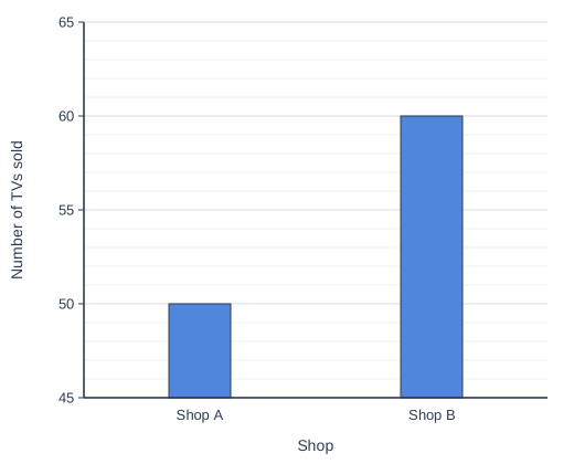
The bar chart shows the number of TVs sold by two shops in one month.

The manager of Shop B says,
"Our bar is three times as tall, so we sold three times as many TVs as Shop A."

Explain why the manager is wrong.

Bar chart of Number of TVs sold for each shop: Shop A 50, Shop B 60.

Model answer

The vertical axis starts at 45, not 0, so the bars only show the amounts above 45 (5 and 15).
Reading the scale, Shop A sold 50 TVs and Shop B sold 60 TVs. Shop B sold \(\dfrac{60}{50} = 1.2\) times as many, not 3 times as many.

Explanation

When the scale on a bar chart does not start at zero, the bar heights are not in proportion to the values, which exaggerates differences. Always read the actual values from the scale before comparing.

Mark scheme
  1. 1 mark

    C1 for the vertical axis does not start at 0, so the heights of the bars are misleading

  2. 1 mark

    C1 for using the values: Shop A sold 50 and Shop B sold 60, so Shop B sold only 10 more (1.2 times as many)

    accept 'only 20% more'

Question 3

3 marks

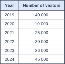
The table shows the number of visitors to a castle each year from 2019 to 2024.

Kai says,
"The number of visitors increased by the greatest percentage from 2023 to 2024."

Is Kai correct?
You must show how you get your answer.

Table with columns "Year", "Number of visitors". Year: 2019; Number of visitors: 40 000 | Year: 2020; Number of visitors: 10 000 | Year: 2021; Number of visitors: 25 000 | Year: 2022; Number of visitors: 30 000 | Year: 2023; Number of visitors: 36 000 | Year: 2024; Number of visitors: 45 000.

Model answer

2023 to 2024: increase \(= 9000\), and \(\dfrac{9000}{36\,000} \times 100 = 25\%\)
2020 to 2021: increase \(= 15\,000\), and \(\dfrac{15\,000}{10\,000} \times 100 = 150\%\)
(2021 to 2022 and 2022 to 2023 are both 20%.)
Kai is not correct: the greatest percentage increase was from 2020 to 2021.

Explanation

A percentage increase compares the increase with the starting value. The 2020 figure was very low, so even though the increase from 2023 to 2024 looks big, the increase from 2020 to 2021 is much larger as a percentage.

Mark scheme
  1. 1 mark

    M1 for the percentage increase from 2023 to 2024, \(\dfrac{9000}{36\,000} \times 100\) (= 25%)

    oe

  2. 1 mark

    M1 for the percentage increase from 2020 to 2021, \(\dfrac{15\,000}{10\,000} \times 100\) (= 150%)

    or any correct comparison showing an increase of more than 25%, e.g. 25 000 is 2.5 times 10 000

  3. 1 mark

    C1 for No, with correct supporting figures, e.g. 2020 to 2021 was an increase of 150%, more than 25%

Question 4

4 marks

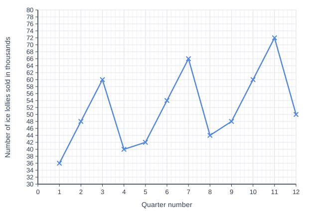
A shop sells ice lollies. The time series graph shows the number of ice lollies it sold in each quarter (three months) from January 2023 to December 2025.
Quarter 1 is January to March 2023, quarter 2 is April to June 2023, and so on.

Work out the percentage increase in the number of ice lollies sold in a year from 2023 to 2025.

Line graph of number of ice lollies sold in thousands (y-axis, 30 to 80) against quarter number (x-axis, 0 to 12). The line joins the points (1, 36), (2, 48), (3, 60), (4, 40), (5, 42), (6, 54), (7, 66), (8, 44), (9, 48), (10, 60), (11, 72), (12, 50).

Model answer

2023: \(36 + 48 + 60 + 40 = 184\) thousand
2025: \(48 + 60 + 72 + 50 = 230\) thousand
Increase \(= 230 - 184 = 46\) thousand
Percentage increase \(= \dfrac{46}{184} \times 100 = 25\%\) (since \(184 \div 4 = 46\))

Explanation

Read the four quarters of each year from the graph and add them to get each year's total. The percentage increase is the increase divided by the original (2023) total. Comparing just one quarter would not give the change for the whole year.

Mark scheme
  1. 1 mark

    M1 for the total for one year, e.g. 36 + 48 + 60 + 40 (= 184) or 48 + 60 + 72 + 50 (= 230)

    values may be in thousands; correct answer with no working scores full marks

  2. 1 mark

    M1 for both totals, 184 and 230, or an increase of 46

  3. 1 mark

    M1 for \(\dfrac{230 - 184}{184} \times 100\) oe

    ft their totals

  4. 1 mark

    A1 for 25%

    cao

Ready to try the rest? Every answer you write is marked against the mark scheme, so you can see exactly where the marks are.

AI Tutor Hints first, answers after you try

Hi! Stuck? Ask me for a hint and I’ll help you work it out. Once you’ve checked your answer I can explain exactly where the marks are.