
Level:
Correct: 0
Incorrect: 0
Marks: 0/0
Exam Practice
Course:
Topics:
AQA GCSE Statistics (Higher Paper 1) Smart practice A mixed round aimed at your weak spots
Unit 1
Planning and collecting data
Unit 2
Representing data
Section C: C1a (tabulation, tally, pictogram); Section E: E3d
Tabulation, tallies, pictograms and tables of data
Section C: C1a (pie chart), C1b (comparative pie chart)
Pie charts and comparative pie charts
Section C: C1a (stem and leaf diagram)
Stem and leaf diagrams
Section C: C2 (bar charts, bar line charts, line charts, frequency polygons)
Bar charts, line charts and frequency polygons
Section C: C2 (cumulative frequency charts)
Cumulative frequency diagrams
Section C: C2 (histograms), C3b
Histograms and frequency density
Section C: C2 (box plots); Section D: D3b; Section E: E5b
Box plots and outliers
Unit 3
Summarising data
Section D: D1a (mode, median, arithmetic mean)
Mode, median and mean
Section D: D1a (weighted mean, geometric mean), D1b
Weighted mean, geometric mean and choosing an average
Section D: D2; Section E: E5a
Skewness
Section D: D3a (range, quartiles, IQR, percentiles, interpercentile and interdecile range)
Range, quartiles, percentiles and interdecile range
Section D: D3a (standard deviation)
Standard deviation
Section C: C2 (time series); Section D: D1a (mean seasonal variation), D4; Section E: E6
Time series, moving averages and seasonal variation
Section C: C2 (scatter charts); Section D: D5
Scatter diagrams, lines of best fit and regression lines
Section D: D6; Section E: E9a, E9b, E9c
Spearman's rank correlation coefficient
Unit 4
Probability
Unit 5
Interpreting and evaluating results
Unit 6
Statistical enquiry cycle
3.6 Statistical enquiry cycle: 3.6.1 Initial planning, 3.6.2 Data collection
Statistical enquiry cycle: planning and data collection
3.6 Statistical enquiry cycle: 3.6.3 Processing and presentation, 3.6.4 Interpretation, 3.6.5 Evaluation
Statistical enquiry cycle: analysis and evaluation
Avg
score:
–
Topics
done:
0/39

Rates of change, including birth and death rates

Practise 14 exam-style questions on Rates of change, including birth and death rates for AQA GCSE Statistics (Higher Paper 1). Write your answer as you would in the exam and get it marked in seconds against the mark scheme, point by point, with the Study Helper on hand if you get stuck.

  • 14 questions
  • 1–5 marks each
  • Instant marking
  • No sign-up needed
14 questions, marked as you go

Sample questions with model answers

Here are 4 of the questions in this topic, each with a model answer, an explanation of why it earns the marks and the mark scheme an examiner would use.

Question 1

1 mark

Two countries have very different population sizes.

Explain why it is better to compare the birth rates of the two countries than to compare their numbers of births.

Model answer

A country with a larger population will have more births just because it has more people. The birth rate is the number of births for every 1000 people, so it takes the size of the population into account and gives a fair comparison.

Explanation

Rates compare like with like: they turn counts into numbers per 1000 people. The number of births mostly reflects the population size, so it is not a fair way to compare countries of different sizes.

Mark scheme
  1. 1 mark

    B1 for an explanation that the birth rate takes the population size into account, eg the birth rate gives the number of births per 1000 people, so it allows a fair comparison between countries with different populations

    oe, eg 'a country with a bigger population will usually have more births, so the numbers of births cannot be compared fairly'. 'Because the populations are different' with no further explanation B0. 'The birth rate is more accurate' B0. Ignore any non-contradictory or irrelevant statements.
Question 2

2 marks

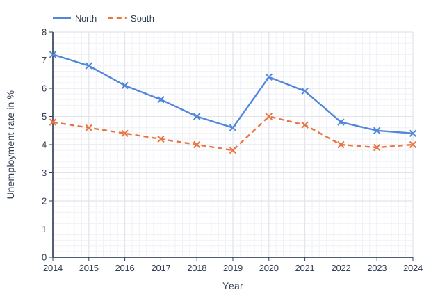
The graph shows the unemployment rates in two regions, North and South, from 2014 to 2024.

\(\text{unemployment rate} = \dfrac{\text{number of unemployed people}}{\text{number of economically active people}} \times 100\)

Compare the unemployment rates in the two regions from 2014 to 2024.

Line graph of unemployment rate in % (y-axis, 0 to 8) against year (x-axis, 2014 to 2024). "North" joins the points (2014, 7.2), (2015, 6.8), (2016, 6.1), (2017, 5.6), (2018, 5), (2019, 4.6), (2020, 6.4), (2021, 5.9), (2022, 4.8), (2023, 4.5), (2024, 4.4). "South" (dashed) joins the points (2014, 4.8), (2015, 4.6), (2016, 4.4), (2017, 4.2), (2018, 4), (2019, 3.8), (2020, 5), (2021, 4.7), (2022, 4), (2023, 3.9), (2024, 4).

Model answer

Comparison 1: The unemployment rate in North was higher than in South in every year from 2014 to 2024.
Comparison 2: Both rates fell overall, but North's fell by more (from 7.2% to 4.4%, compared with 4.8% to 4.0% in South), so the gap between the regions narrowed.

Explanation

Compare the two lines across the whole period: which is higher, the overall trend of each, and whether the gap changes. The graph shows rates (percentages of economically active people), so comments about the number of unemployed people do not score.

Mark scheme
  1. 2 marks

    B2 for two different correct comparisons, eg
    the unemployment rate in North was higher than in South in every year
    the unemployment rates in both regions fell overall from 2014 to 2024
    the rate fell by more in North than in South / the gap between the regions narrowed (from 2.4 to 0.4 percentage points)
    both regions had a sharp rise in 2020, then the rates fell again

    1 mark for each different correct comparison, max 2 (B1 for one). Each comment must cover a range of years, not a single year or two adjacent years (the rise in 2020 followed by a fall in both regions is a pattern over several years and is accepted), and must compare or describe both regions. Reference to the 'number of unemployed people' rather than the rate B0. If more than two comments are given and at least one is incorrect, B1 max. Any values stated must be roughly correct (allow ±0.2).

Question 3

3 marks

In 2018, a town had a population of 50 000 and a death rate of 8.9
In 2023, the town had a population of 60 000 and a death rate of 9.6

\(\text{death rate} = \dfrac{\text{number of deaths}}{\text{total population}} \times 1000\)

Eli says,
"The number of deaths in the town went up by 0.7 from 2018 to 2023."

Explain why Eli is wrong, and work out the increase in the number of deaths.

Model answer

The death rate is the number of deaths per 1000 people, so 0.7 is the increase in deaths per 1000 people, not in the number of deaths. The population also changed.
2018: \(\dfrac{8.9 \times 50\,000}{1000} = 445\) deaths
2023: \(\dfrac{9.6 \times 60\,000}{1000} = 576\) deaths
Increase \(= 576 - 445 = 131\) deaths

Explanation

A rate is not a count. To find each number of deaths, multiply the death rate by the population and divide by 1000, then subtract. Because the population grew as well, the number of deaths rose by much more than the change in the rate suggests.

Mark scheme
  1. 1 mark

    B1 for an explanation, eg 0.7 is the increase in the death rate (the number of deaths per 1000 people), not in the number of deaths / the population has also changed

    oe. 'The death rate is not the number of deaths' B1. 'He has subtracted wrongly' B0.

  2. 1 mark

    M1 for \(\dfrac{8.9 \times 50\,000}{1000}\) (= 445) or \(\dfrac{9.6 \times 60\,000}{1000}\) (= 576)

    oe, eg 8.9 × 50 or 9.6 × 60

  3. 1 mark

    A1 for 131

    Correct answer with no working scores M1A1. Using the same population for both years, eg 0.7 × 50 = 35, scores M0A0.

Question 4

4 marks

\(\text{unemployment rate} = \dfrac{\text{number of unemployed people}}{\text{number of economically active people}} \times 100\)

In 2023, the unemployment rate in a region was 4.8% and 21 600 people were unemployed.

In 2024, the number of economically active people in the region was 5000 more than in 2023, and the number of unemployed people was 900 fewer than in 2023.

Work out the unemployment rate in the region in 2024.
Give your answer to 2 decimal places.

Model answer

2023: economically active people \(= \dfrac{21\,600 \times 100}{4.8} = 450\,000\)
2024: economically active people = 450 000 + 5000 = 455 000
2024: unemployed people = 21 600 - 900 = 20 700
Unemployment rate in 2024 \(= \dfrac{20\,700}{455\,000} \times 100 = 4.549... = 4.55\)% (2 d.p.)

Explanation

Work backwards from the 2023 rate to find the number of economically active people, then change both numbers for 2024 and use the formula again. A common error is to keep the 2023 number of economically active people, which gives 4.6%.

Mark scheme
  1. 1 mark

    M1 for \(\dfrac{21\,600 \times 100}{4.8}\) or 21 600 ÷ 0.048 (= 450 000)

    oe. The number of economically active people in 2023; this value is exact, so accept 450 000 only.

  2. 1 mark

    M1 for their 450 000 + 5000 (= 455 000) and 21 600 - 900 (= 20 700)

    oe. Both 2024 values.

  3. 1 mark

    M1dep for \(\dfrac{20\,700}{455\,000} \times 100\)

    oe, using their values

  4. 1 mark

    A1 for 4.55 [4.545, 4.555]

    The exact value is 4.5494...; accept more accurate values in the range. Correct answer with no working scores 4 marks. 20 700 ÷ 450 000 × 100 = 4.6 (not adding the 5000) scores M1M0M0A0. 4.8% of 455 000 = 21 840 is not a method for the 2024 rate: M1M0M0A0 at most.

Ready to try the rest? Every answer you write is marked against the mark scheme, so you can see exactly where the marks are.

Study Helper Hints first, answers after you try

Stuck on this one? Ask for a hint and I’ll point you in the right direction, without giving the answer away. Once you’ve checked your answer, I’ll show you how the marks are awarded.