Level:
Correct: 0
Incorrect: 0
Marks: 0/0
Exam Practice
Course:
Topics:
AQA GCSE Statistics (Higher Paper 2) Smart practice A mixed round aimed at your weak spots
Unit 1
Planning and collecting data
Unit 2
Representing data
Section C: C1a (tabulation, tally, pictogram); Section E: E3d
Tabulation, tallies, pictograms and tables of data
Section C: C1a (pie chart), C1b (comparative pie chart)
Pie charts and comparative pie charts
Section C: C1a (stem and leaf diagram)
Stem and leaf diagrams
Section C: C2 (bar charts, bar line charts, line charts, frequency polygons)
Bar charts, line charts and frequency polygons
Section C: C2 (cumulative frequency charts)
Cumulative frequency diagrams
Section C: C2 (histograms), C3b
Histograms and frequency density
Section C: C2 (box plots); Section D: D3b; Section E: E5b
Box plots and outliers
Unit 3
Summarising data
Section D: D1a (mode, median, arithmetic mean)
Mode, median and mean
Section D: D1a (weighted mean, geometric mean), D1b
Weighted mean, geometric mean and choosing an average
Section D: D2; Section E: E5a
Skewness
Section D: D3a (range, quartiles, IQR, percentiles, interpercentile and interdecile range)
Range, quartiles, percentiles and interdecile range
Section D: D3a (standard deviation)
Standard deviation
Section C: C2 (time series); Section D: D1a (mean seasonal variation), D4; Section E: E6
Time series, moving averages and seasonal variation
Section C: C2 (scatter charts); Section D: D5
Scatter diagrams, lines of best fit and regression lines
Section D: D6; Section E: E9a, E9b, E9c
Spearman's rank correlation coefficient
Unit 4
Probability
Unit 5
Interpreting and evaluating results
Unit 6
Statistical enquiry cycle
3.6 Statistical enquiry cycle: 3.6.1 Initial planning, 3.6.2 Data collection
Statistical enquiry cycle: planning and data collection
3.6 Statistical enquiry cycle: 3.6.3 Processing and presentation, 3.6.4 Interpretation, 3.6.5 Evaluation
Statistical enquiry cycle: analysis and evaluation
Avg
score:
–
Topics
done:
0/39

Cumulative frequency diagrams

Practise 17 exam-style questions on Cumulative frequency diagrams for AQA GCSE Statistics (Higher Paper 2). Write your answer as you would in the exam and get it marked in seconds against the mark scheme, point by point, with the Study Helper on hand if you get stuck.

  • 17 questions
  • 1–6 marks each
  • Instant marking
  • No sign-up needed
17 questions, marked as you go

Sample questions with model answers

Here are 4 of the questions in this topic, each with a model answer, an explanation of why it earns the marks and the mark scheme an examiner would use.

Question 1

1 mark

Jamal recorded how long each of 200 shoppers spent in a supermarket. He grouped the times and drew a cumulative frequency curve. He used the curve to find the median time.

Explain why Jamal's median is only an estimate.

Model answer

Jamal grouped the times, so he no longer knows the exact time of each shopper. The curve is plotted only at the class boundaries, and its shape between them assumes how the times are spread within each class, so the median read from it is an estimate.

Explanation

Once data are grouped, only the class frequencies are known. A cumulative frequency curve joins the points at the upper class boundaries, so any reading between them depends on an assumption about how the values are spread. Answers that only say 'it is an estimate' or blame the sample do not explain this.

Mark scheme
  1. 1 mark

    B1 for the data are grouped, so the exact times are not known / the shape of the curve between the plotted points is assumed

    oe, eg 'we only know how many shoppers are in each class, not their actual times', 'the curve is only plotted at the class boundaries, so values in between are guesses', 'it assumes the times are spread smoothly through each class'. 'Because it is read from a graph' with no further reason B0. 'Because it is an estimate' B0. 'The sample is too small' or 'the shoppers might not be representative' B0 (these are about the sample, not about why the median is an estimate). Ignore any non-contradictory or irrelevant statements.
Question 2

2 marks

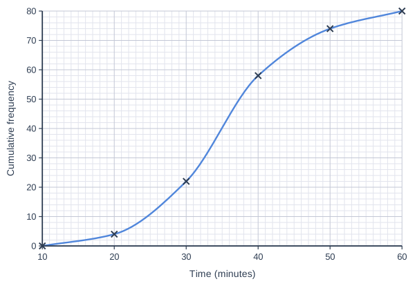
A furniture shop timed 80 customers assembling the same flat-pack bookcase.
The cumulative frequency graph shows the results.

Zoe says,
"The upper quartile is about 51 minutes, because I read across from 75 on the cumulative frequency axis."

Explain Zoe's mistake.
Use the graph to find a correct estimate of the upper quartile.

Cumulative frequency graph on a grid of small squares. The horizontal axis is "Time (minutes)", from 10 to 60, numbered every 10, with 10 small squares between numbered values (each small square is 1). The vertical axis is "Cumulative frequency", from 0 to 80, numbered every 10, with 5 small squares between numbered values (each small square is 2). A smooth curve starts at (10, 0) and passes through (20, 4), (30, 22), (40, 58), (50, 74) and (60, 80) (each point is marked with a cross).

Model answer

There are 80 customers, so the upper quartile is the \(\dfrac{3}{4} \times 80 = 60\)th value. Zoe read across from 75, which is three quarters of 100, not of 80; the 75th value is near the top of the data.
Reading across from 60 to the curve and down: upper quartile \(\approx\) 41 minutes.

Explanation

The quartiles are read from a quarter and three quarters of the total frequency, which here is 80, so read across from 20 and 60. Reading from 25 and 75 is only correct when there are 100 values, and here it gives a value close to the longest times.

Mark scheme
  1. 1 mark

    B1 for she used 75, which is three quarters of 100, but there are 80 customers, so she should read across from 60 (three quarters of 80)

    oe, eg 'she treated the data as if there were 100 values', 'the upper quartile is the 60th value, not the 75th'. Accept 60.75 as the position. 'She read the graph wrongly' or 'she used the wrong number' with no detail B0. 'She should have read across from 25' B0.

  2. 1 mark

    B1 for [40, 42] (minutes)

    From the drawn curve, reading across from 60 gives about 40.9 minutes (reading from 60.75 gives slightly more, still in the range). Correct answer with no working scores B1. 51 (Zoe's value) B0; 29 (the lower quartile) B0.

Question 3

3 marks

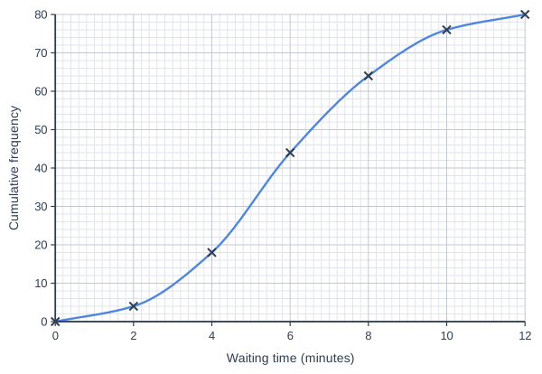
A takeaway recorded how long 80 customers waited for their orders on Friday.
The cumulative frequency graph shows the results.

On Saturday, the takeaway recorded the waiting times of 20 more customers. All 20 of them waited more than 15 minutes.

Estimate the median waiting time of all 100 customers.

Cumulative frequency graph on a grid of small squares. The horizontal axis is "Waiting time (minutes)", from 0 to 12, numbered every 2, with 10 small squares between numbered values (each small square is 0.2). The vertical axis is "Cumulative frequency", from 0 to 80, numbered every 10, with 5 small squares between numbered values (each small square is 2). A smooth curve starts at (0, 0) and passes through (2, 4), (4, 18), (6, 44), (8, 64), (10, 76) and (12, 80) (each point is marked with a cross).

Model answer

There are 100 customers, so the median is the 50th waiting time.
All 20 Saturday customers waited longer than every Friday customer, so the 50th shortest wait is the 50th shortest Friday wait.
Reading across from 50 on Friday's graph: median \(\approx\) 6.5 minutes

Explanation

Adding 20 values that are all larger than the existing data moves the median position from the 40th value to the 50th value, but the 50th value is still one of Friday's customers, so it can be read from Friday's graph. The new median is higher than Friday's median, about 5.7 minutes.

Mark scheme
  1. 1 mark

    M1 for 50 (or 50.5) as the position of the median of all 100 customers

    oe, eg '100 ÷ 2 = 50'.

  2. 1 mark

    M1dep for reading across from their 50 (or 50.5) on Friday's graph

    Every Friday customer waited less than 12 minutes and every Saturday customer more than 15 minutes, so the 50th shortest wait of all 100 is the 50th shortest Friday wait. May be implied by an answer in range.

  3. 1 mark

    A1 for [6.3, 6.8] (minutes)

    From the drawn curve, reading across from 50 gives about 6.5 minutes. Correct answer with no working scores M1M1A1. The median of Friday's customers only (reading across from 40, about 5.7 minutes) scores M0M0A0. Reading across from 60 (about 7.5 minutes) scores M0M0A0.

Question 4

4 marks

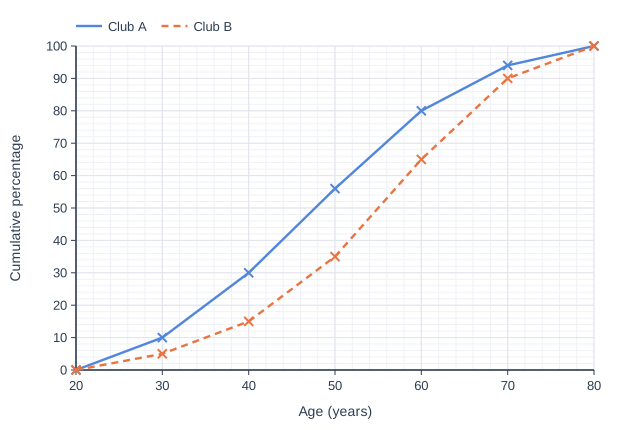
Two walking clubs, A and B, recorded the ages of their members. Club A has 300 members and Club B has 160 members.
The graph shows the cumulative percentage of the members of each club by age.

The secretary of Club B says,
"Club A has more members aged over 55 than Club B, but a smaller proportion of its members are aged over 55."

Is the secretary correct?
You must show your working.

Line graph of cumulative percentage (y-axis, 0 to 100) against age (years) (x-axis, 20 to 80). "Club A" joins the points (20, 0), (30, 10), (40, 30), (50, 56), (60, 80), (70, 94), (80, 100). "Club B" (dashed) joins the points (20, 0), (30, 5), (40, 15), (50, 35), (60, 65), (70, 90), (80, 100).

Model answer

At 55 years: Club A cumulative percentage = 68%, so 100 - 68 = 32% of Club A are over 55.
Club B cumulative percentage = 50%, so 100 - 50 = 50% of Club B are over 55.
Numbers over 55: Club A 0.32 × 300 = 96, Club B 0.5 × 160 = 80
Club A has more members over 55 (96 > 80), but a smaller proportion (32% < 50%).
The secretary is correct.

Explanation

A cumulative percentage graph lets you compare groups of different sizes, because each graph goes up to 100%. Read each graph at 55, subtract from 100% to get the proportion over 55, then multiply by the size of the club to get a number. A larger club can have more older members even though they make up a smaller proportion of it.

Mark scheme
  1. 1 mark

    M1 for a cumulative percentage at 55 years for one club: Club A [66, 70] or Club B [48, 52]

    The graphs are straight lines between the plotted points; at 55 years Club A is 68% and Club B is 50% (halfway between the points at 50 and 60 years).

  2. 1 mark

    A1 for the percentages aged over 55: Club A [30, 34]% and Club B [48, 52]%

    100 - their readings. Exact values 32% and 50%.

  3. 1 mark

    M1 for changing a percentage over 55 into a number of members, eg 0.32 × 300 or 0.5 × 160

    ft their percentages.

  4. 1 mark

    A1 for Yes, with Club A [90, 102] and Club B [76, 84] members over 55, and the percentages

    eg 'Yes: Club A has 96 members over 55 and Club B has 80, but 32% < 50%'. Both parts of the statement must be checked. The question says 'You must show your working': 'Yes' with no working scores 0. Comparing only the percentages and saying 'No, Club B has more older members' scores M1A1M0A0.

Ready to try the rest? Every answer you write is marked against the mark scheme, so you can see exactly where the marks are.

Study Helper Hints first, answers after you try

Stuck on this one? Ask for a hint and I’ll point you in the right direction, without giving the answer away. Once you’ve checked your answer, I’ll show you how the marks are awarded.