
Level:
Correct: 0
Incorrect: 0
Marks: 0/0
Exam Practice
Course:
Topics:
Edexcel GCSE Statistics (Higher Paper 1) Smart practice A mixed round aimed at your weak spots
Unit 1
The statistical enquiry cycle
Statistical enquiry cycle stages 1 and 2; (a) Planning: 1a.01, 1a.02, 1a.03
Statistical enquiry cycle: planning and collecting
Statistical enquiry cycle stages 3, 4 and 5
Statistical enquiry cycle: interpreting and evaluating
Unit 2
The collection of data
(b) Types of data: 1b.01, 1b.02, 1b.03
Types of data and variables
(b) Types of data: 1b.04; (d) Collecting data: 1d.01, 1d.02
Primary and secondary data, reliability and validity
(c) Population and sampling: 1c.01, 1c.02, 1c.03
Populations, sampling frames and non-random sampling
(c) Population and sampling: 1c.04, 1c.05
Random and systematic sampling
(c) Population and sampling: 1c.06
Stratified sampling
(d) Collecting data: 1d.05, 1d.06
Problems with collected data and cleaning data
Unit 3
Processing, representing and analysing data
(a) Tabulation, diagrams and representation: 2a.01
Tabulation, tallies, pictograms and two-way tables
(a) Tabulation, diagrams and representation: 2a.01, 2a.02
Pie charts and comparative pie charts
(a) Tabulation, diagrams and representation: 2a.01
Stem and leaf diagrams
(a) Tabulation, diagrams and representation: 2a.02
Population pyramids, choropleth maps and 2D and 3D diagrams
(a) Tabulation, diagrams and representation: 2a.04
Histograms and frequency density
(a) Tabulation, diagrams and representation: 2a.05, 2a.06, 2a.07, 2a.08
Choosing representations and misleading diagrams
(a) Tabulation, diagrams and representation: 2a.09, 2a.10
Skewness
(b) Measures of central tendency: 2b.01, 2b.02, 2b.03
Mode, median and mean
(b) Measures of central tendency: 2b.01
Weighted mean and geometric mean
(c) Measures of dispersion: 2c.01, 2c.06
Standard deviation and standardised scores
(a) Tabulation, diagrams and representation: 2a.03; (c) Measures of dispersion: 2c.02, 2c.03
Box plots and outliers
(b) Measures of central tendency: 2b.03; (c) Measures of dispersion: 2c.04, 2c.05
Comparing distributions
(d) Further summary statistics: 2d.01
Index numbers
(d) Further summary statistics: 2d.02
Rates of change
(e) Scatter diagrams and correlation: 2e.01, 2e.02, 2e.03
Scatter diagrams, correlation and causation
(e) Scatter diagrams and correlation: 2e.04
Lines of best fit and regression lines
(e) Scatter diagrams and correlation: 2e.05, 2e.06, 2e.07, 2e.08
Spearman's rank and product moment correlation coefficients
(f) Time series: 2f.01, 2f.02; (b) 2b.01 mean seasonal variation
Time series, moving averages and seasonal variation
(g) Quality assurance: 2g.01, 2g.02
Quality assurance and control charts
(h) Estimation: 2h.01, 2h.02, 2h.03
Estimation, sample size and capture-recapture
Unit 4
Probability
3. Probability: 3p.01, 3p.02, 3p.03, 3p.04
Probability, expected frequency and risk
3. Probability: 3p.05, 3p.06, 3p.10
Experimental and theoretical probability and bias
3. Probability: 3p.11
Binomial distribution
3. Probability: 3p.12, 3p.13
Normal distribution
Avg
score:
–
Topics
done:
0/40

Comparing distributions

Practise 17 exam-style questions on Comparing distributions for Edexcel GCSE Statistics (Higher Paper 1). Write your answer as you would in the exam and get it marked in seconds against the mark scheme, point by point, with the Study Helper on hand if you get stuck.

  • 17 questions
  • 1–6 marks each
  • Instant marking
  • No sign-up needed
17 questions, marked as you go

Sample questions with model answers

Here are 4 of the questions in this topic, each with a model answer, an explanation of why it earns the marks and the mark scheme an examiner would use.

Question 1

1 mark

Kemi recorded the time, in minutes, that each customer spent in a supermarket on a Saturday and on a Tuesday. The frequency polygons show her results.

Use the modal classes to compare the times that customers spent in the supermarket on the two days.
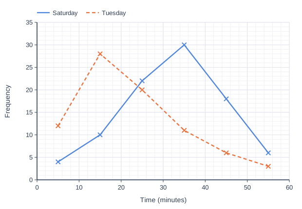
Line graph of frequency (y-axis, 0 to 35) against time (minutes) (x-axis, 0 to 60). "Saturday" joins the points (5, 4), (15, 10), (25, 22), (35, 30), (45, 18), (55, 6). "Tuesday" (dashed) joins the points (5, 12), (15, 28), (25, 20), (35, 11), (45, 6), (55, 3).

Model answer

The modal class for Saturday is 30 < t ≤ 40 minutes and the modal class for Tuesday is 10 < t ≤ 20 minutes.
The modal class is higher on Saturday, so customers tended to spend longer in the supermarket on Saturday than on Tuesday.

Explanation

The modal class is the class with the highest frequency, so on a frequency polygon it is the class whose midpoint is at the highest point. A comparison must say which is greater and what that means in context. A common error is to compare the heights of the peaks, which only tells you how many customers there were.

Mark scheme
  1. 1 mark

    B1 for a correct comparison of the modal classes in context, e.g. the modal class for Saturday (30 < t ≤ 40) is higher than the modal class for Tuesday (10 < t ≤ 20), so customers tended to spend longer in the supermarket on Saturday

    The comparison must be in context (time spent in the supermarket). Accept the modal classes described by their midpoints (35 and 15) or as '30 to 40' and '10 to 20'. B0 for only stating the two modal classes with no comparison, or using 'whereas' with the two classes. B0 for comparing frequencies (e.g. 'more customers on Saturday').
Question 2

2 marks

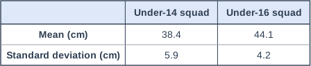
A coach measured the vertical jump heights, in cm, of the players in an under-14 netball squad and of the players in an under-16 netball squad. The table shows information about the heights.

Compare the jump heights of the two squads.

Table with columns (row headings), "Under-14 squad", "Under-16 squad". Mean (cm); Under-14 squad: 38.4; Under-16 squad: 44.1 | Standard deviation (cm); Under-14 squad: 5.9; Under-16 squad: 4.2.

Model answer

The mean jump height of the under-16 squad (44.1 cm) is greater than that of the under-14 squad (38.4 cm), so the under-16 players jumped higher on average.
The standard deviation for the under-16 squad (4.2 cm) is smaller than for the under-14 squad (5.9 cm), so the under-16 players' jump heights were more consistent.

Explanation

The mean is compared for the average and the standard deviation for the spread. A smaller standard deviation means the values are closer together, so more consistent. Students sometimes describe a larger standard deviation as 'better' or 'higher jumps', which confuses spread with average.

Mark scheme
  1. 1 mark

    B1 for a correct comparison of the means in context, e.g. the under-16 players jumped higher on average (44.1 > 38.4)

    Accept 'average' for mean if both means are quoted and compared. B0 for 'the mean is 38.4 whereas it is 44.1' with no comparison.

  2. 1 mark

    B1 for a correct comparison of the standard deviations in context, e.g. the jump heights of the under-16 players were more consistent / less varied (4.2 < 5.9)

    B0 for linking the standard deviation to the height of the jumps, e.g. 'the under-14s have a bigger standard deviation so they jump higher'. If both comparisons are correct but neither is in context, award B1 only. Ignore values.

Question 3

3 marks

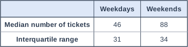
A cinema manager recorded the number of tickets sold for each screening on weekdays and at weekends over three months. The table shows information about the numbers of tickets sold.

The manager says, "At weekends we sell more tickets per screening, and the number of tickets sold is more consistent."

Do the statistics support the manager's conclusions? You must give reasons for your answer.

Table with columns (row headings), "Weekdays", "Weekends". Median number of tickets; Weekdays: 46; Weekends: 88 | Interquartile range; Weekdays: 31; Weekends: 34.

Model answer

The median number of tickets per screening is higher at weekends (88 > 46), so on average more tickets are sold at weekends. This supports the first conclusion.
The interquartile range is higher at weekends (34 > 31), so the numbers of tickets sold at weekends are less consistent, not more. This does not support the second conclusion.
So the statistics support the first conclusion but not the second.

Explanation

Test each conclusion against the right statistic: 'more tickets' against the average and 'more consistent' against the spread. A smaller spread means more consistent, so a larger IQR at weekends contradicts the second claim. A common error is to forget to say whether each conclusion is supported.

Mark scheme
  1. 1 mark

    B1 for a correct comparison of the medians, e.g. the median at weekends is higher (88 > 46), so more tickets are sold per screening at weekends on average

    Accept 'average' for median if both medians are quoted and compared. B0 for stating the values with no comparison.

  2. 1 mark

    B1 for a correct comparison of the interquartile ranges, e.g. the IQR at weekends is higher (34 > 31), so the numbers of tickets sold at weekends are less consistent

    B0 for linking the IQR to the number of tickets sold.

  3. 1 mark

    B1 (dep) for a correct decision on both conclusions: the first conclusion (more tickets at weekends) is supported, but the second (more consistent at weekends) is not supported

    Dependent on both B1 marks above (the question asks for reasons). B0 for 'yes' or 'no' overall with no distinction between the two conclusions.

Question 4

4 marks

Two Year 10 groups, 10A and 10B, took the same spelling test. The test was marked out of 30. 10A has 11 students and 10B has 15 students. Here are their marks, in order.

10A:   12   15   17   18   18   20   21   22   24   25   28
10B:   16   17   18   19   19   20   21   21   22   22   22   23   24   25   27

Compare the marks of the two groups. You should show clearly the value of any statistics you use.

Model answer

10A (11 marks): median = 6th value = 20, lower quartile = 3rd value = 17, upper quartile = 9th value = 24, IQR = 24 - 17 = 7
10B (15 marks): median = 8th value = 21, lower quartile = 4th value = 19, upper quartile = 12th value = 23, IQR = 23 - 19 = 4
The median for 10B is higher than for 10A (21 > 20), so 10B scored higher marks on average.
The IQR for 10B is smaller than for 10A (4 < 7), so 10B's marks were more consistent.

Explanation

Calculate a matching average and spread for each group, using each group's own number of values to find the positions, then write two comparisons that state which value is bigger and what it means for the marks. When the question asks to show the values, listing two numbers or using 'whereas' does not count as a comparison. Comparing the highest or lowest marks scores nothing.

Mark scheme
  1. 1 mark

    B1 for medians 20 (10A) and 21 (10B)

    The 6th value of 10A and the 8th value of 10B. Accept means 20 and 21.1 (21.06...) instead.

  2. 1 mark

    B1 for interquartile ranges 7 (10A) and 4 (10B)

    24 - 17 (3rd and 9th values) and 23 - 19 (4th and 12th values). Also accept 6 and 3.5 (from the n/4 and 3n/4 positions by interpolation), ranges 16 and 11, or standard deviations 4.43 and 2.91.

  3. 1 mark

    B1ft for a correct comparison of the averages in context, with the values compared, e.g. 10B scored higher marks on average, as 21 > 20

    ft their averages. The values must be compared (in symbols or words); '20 and 21' or 'whereas' alone is B0.

  4. 1 mark

    B1ft for a correct comparison of the spreads in context, with the values compared, e.g. 10B's marks were more consistent, as 4 < 7

    ft their measures of spread. B0 for linking the spread to higher or lower marks. A correct comparison of an average and a spread that are not a matching pair (e.g. means and IQRs) can still score both marks.

Ready to try the rest? Every answer you write is marked against the mark scheme, so you can see exactly where the marks are.

Study Helper Hints first, answers after you try

Stuck on this one? Ask for a hint and I’ll point you in the right direction, without giving the answer away. Once you’ve checked your answer, I’ll show you how the marks are awarded.