Practise 30 exam-style questions on Graphs and charts for AQA GCSE Geography (Paper 3). Write your answer as you would in the exam and get it marked in seconds against the mark scheme, point by point, with an AI tutor on hand if you get stuck.
30 questions
1–6 marks each
Instant marking
No sign-up needed
20 questions, marked as you go
Sample questions with model answers
Here are 4 of the questions in this topic, each with a model answer, an explanation of why it earns the marks and the mark scheme an examiner would use.
Question 1
1 mark
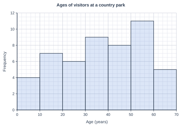
Figure 1 is a histogram showing the ages of 50 visitors surveyed at a country park.
State the modal class.
Model answer
50-60 years
Explanation
The modal class is the class with the highest frequency, so it is the tallest bar on the histogram: 11 visitors were aged 50-60. Give the class itself, not the frequency of the bar.
Mark scheme
1 mark
50-60 years
Accept 50 to 59 years. Do not accept a single age (e.g. 55) or the frequency (11).
Question 2
2 marks
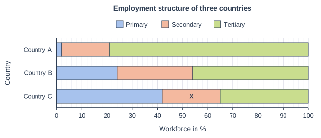
Figure 1 is a divided bar chart showing the percentage of the workforce in each sector of the economy in three countries. In Country C, 42% of the workforce is employed in the primary sector and 35% in the tertiary sector. The secondary part of the bar for Country C is labelled X.
Calculate the value of X.
Model answer
42 + 35 = 77%. The three sectors make up the whole workforce, so X = 100 − 77 = 23%.
Explanation
Each bar in a percentage divided bar chart adds up to 100%, so a missing part is 100 minus the parts you know. Check that your answer looks the right size against the scale.
Mark scheme
1 mark
Working: 42 + 35 = 77; 100 − 77
Correct answer with no working scores full marks.
1 mark
23%
Question 3
3 marks
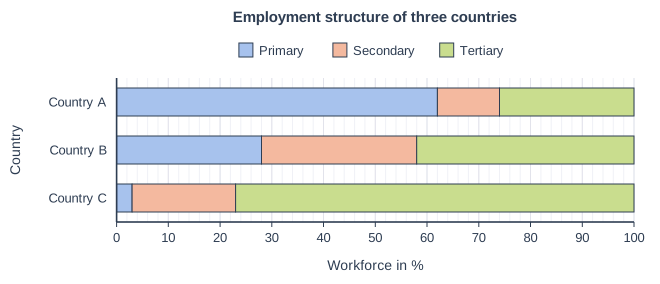
Figure 1 is a divided bar chart showing the employment structure of three countries.
Which country is most likely to be a low-income country (LIC)? Use evidence from Figure 1 to support your answer.
Model answer
Country A is most likely to be an LIC. About 62% of its workforce is in the primary sector, the highest of the three countries, and only about 26% is in the tertiary sector, compared with about 77% in Country C.
Explanation
LICs usually have most people working in the primary sector (mainly farming) and few in manufacturing or services; HICs have most in the tertiary sector. Always quote values read from the scale as your evidence.
Mark scheme
1 mark
Country A
The evidence marks can be awarded only if Country A is chosen.
1 mark
It has the highest proportion in the primary sector: about 62% of the workforce (e.g. farming)
max 2 evidence marks; accept values within 2%.
1 mark
It has the lowest proportion in the tertiary sector (about 26%) / the secondary sector (about 12%)
1 mark
A comparison with an HIC such as Country C, which has only about 3% in primary and about 77% in tertiary
Question 4
6 marks
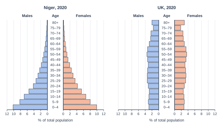
Figure 1 shows the population pyramids of Niger and the UK in 2020.
Compare the population structures of the two countries. Suggest reasons for the differences.
Model answer
The two pyramids are very different shapes. Niger's has a very wide base, with about 20% of the population aged 0-4 and about half aged under 15, whereas the UK's base is narrow, with only about 6% aged 0-4 and about 17% under 15. Niger's pyramid narrows quickly into a triangle with a very small top: only about 2% of people are aged 65 and over. The UK's sides are almost straight, and about 18% of people are aged 65 and over, with a wide bar for women aged 80+.
The wide base in Niger is caused by a very high birth rate. Many families depend on farming, so children are needed to help work the land and to support their parents in old age, and access to contraception is limited. Infant mortality is also high, so parents have more children in case some die. In the UK, family planning is widely available, many women have careers and children are expensive to raise, so the birth rate is low and the base is narrow.
The narrow top in Niger reflects a short life expectancy: poor healthcare, malnutrition and diseases linked to unsafe water mean few people reach old age. In the UK, good healthcare, diets and living conditions mean people live into their 80s, giving a much larger elderly population. This fits the Demographic Transition Model, with Niger at stage 2 and the UK at stage 4.
Explanation
Top answers do two things: a direct comparison using figures from both pyramids ('whereas', 'but') and developed reasons that link the shape to birth rates, death rates and life expectancy. Answers that describe each pyramid separately, or that give reasons without evidence from the figure, stay in Level 2.
Mark scheme
6 marks
Levels of response (6 marks). Level 3 (5-6 marks): Detailed comparison of the two structures that makes effective use of data from Figure 1 (e.g. proportions of young and elderly people, shape of base, sides and top). Well-developed reasons for the differences, clearly linked to birth rates, death rates and life expectancy and to the countries' levels of development. Level 2 (3-4 marks): Clear comparison with some use of data from Figure 1. Some reasons are given and partly developed, though the answer may be unbalanced (mostly description or mostly explanation). Level 1 (1-2 marks): Basic comparison, or the pyramids are described separately, with little or no use of data. Reasons are simple statements or missing. 0 marks: nothing worthy of credit.
Indicative content (not a checklist; credit other valid points): Niger has a very wide base (about 20% aged 0-4, about half under 15) whereas the UK has a narrow base (about 6% aged 0-4, about 17% under 15); Niger's pyramid narrows quickly into a triangle, while the UK's has straight, almost vertical sides; Niger has very few elderly people (about 2% aged 65+) but the UK has about 18% aged 65+; the UK has a wider top, especially women aged 80+, and a bulge at 50-59; Niger has a high birth rate because of a lack of access to contraception, early marriage, children needed to work on farms and to look after parents, and high infant mortality (parents have more children in case some die); the UK has a low birth rate because of family planning, women in education and careers, and the cost of raising children; Niger's short life expectancy is due to poor healthcare, malnutrition, unsafe water and disease, so few people reach old age; the UK's long life expectancy is due to good healthcare, diet and living standards, so many people live into their 80s; Niger is an LIC at stage 2 of the Demographic Transition Model, the UK an HIC at stage 4.
Ready to try the rest? Every answer you write is marked against the mark scheme, so you can see exactly where the marks are.
Ctrl + Enter to check
AI TutorHints first, answers after you try
Hi! Stuck? Ask me for a hint and I’ll help you work it out. Once you’ve checked your answer I can explain exactly where the marks are.