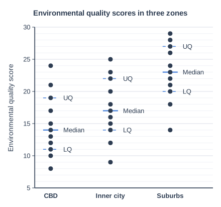
Students tested the hypothesis 'Environmental quality improves with distance from the CBD'. They recorded environmental quality scores at 11 sites in each of three zones of a city: the CBD, the inner city and the suburbs. Figure 1 shows the results as a dispersion graph.
Using Figure 1, assess the extent to which the results support the hypothesis.
Model answer
Overall, the results support the hypothesis. The median environmental quality score rises with distance from the CBD: 14 in the CBD, 17 in the inner city and 23 in the suburbs. Both quartiles also rise from zone to zone, and the means show the same pattern (about 15, 17 and 23).
The evidence is strongest for the suburbs. Their interquartile range runs from 20 to 27, which does not overlap the CBD's interquartile range of 11 to 19 at all, so suburban sites are clearly better. However, the difference between the CBD and the inner city is much smaller: their interquartile ranges (11-19 and 14-22) overlap a lot, so this part of the hypothesis is only weakly supported. There are also individual exceptions: the best CBD site scored 24, higher than the median suburban site, and the worst suburban site scored only 14, the same as the CBD median.
The method also limits the conclusion. Grouping sites into zones hides how quality changes with actual distance within each zone, 11 sites per zone is a small sample, and environmental quality scores are subjective.
In conclusion, the results support the hypothesis to a fairly large extent, because every average rises outwards, but the support is strong only for the contrast between the suburbs and the other two zones.
Explanation
Dispersion graphs let you compare averages and spread: use medians and quartiles for each zone and comment on the overlap between them. Large overlap means a difference is less convincing, so the best answers judge that support is strong for the suburbs but weak between the CBD and inner city.