Practise 34 exam-style questions on Population and uneven development for AQA GCSE Geography (Paper 2). Write your answer as you would in the exam and get it marked in seconds against the mark scheme, point by point, with an AI tutor on hand if you get stuck.
34 questions
1–12 marks each
Instant marking
No sign-up needed
20 questions, marked as you go
Sample questions with model answers
Here are 4 of the questions in this topic, each with a model answer, an explanation of why it earns the marks and the mark scheme an examiner would use.
Question 1
1 mark
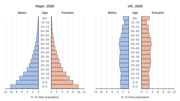
Figure 1 shows population pyramids for Niger and the UK in 2020.
Using Figure 1, identify the largest age group in Niger.
Model answer
The 0–4 age group.
Explanation
The longest bars on Niger's pyramid are at the bottom, for 0–4 year olds (about 10% male and 10% female, so about 20% of the population). This very wide base shows a high birth rate, typical of an LIC in stage 2 of the DTM.
Mark scheme
1 mark
0–4 (years)
Accept 'under 5s' / 'children aged 0 to 4'. Do not accept a wider band such as 0–14 or 'young people'.
Question 2
2 marks
Give two reasons why people migrate from LICs to HICs.
Model answer
People move to HICs because wages are much higher and there are more jobs. They may also be escaping conflict or persecution in their home country.
Explanation
Reasons can be push factors (problems at home, such as poverty or war) or pull factors (attractions of the HIC, such as jobs and services). Both are linked to the development gap between poorer and richer countries.
Mark scheme
1 mark
One valid reason, e.g. more jobs / higher wages in HICs; better healthcare or education; safety / political freedom; poverty or unemployment at home; escaping conflict, persecution or natural disasters; family already living in the HIC
Push or pull factors are both acceptable.
1 mark
A second, different reason from the list
Do not credit two versions of the same idea (e.g. 'more jobs' and 'better jobs').
Question 3
4 marks
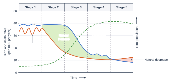
Figure 1 shows the Demographic Transition Model (DTM), including the total population.
Using Figure 1, describe how the total population changes through the five stages.
Model answer
In stage 1 the total population is low and steady. In stage 2 it starts to rise and grows faster and faster. In stage 3 it continues to rise but the growth slows down. In stage 4 it levels off and stays high and steady, and in stage 5 it falls slowly because the birth rate is below the death rate.
Explanation
Describe the dashed population line stage by stage. The population grows when the birth rate is above the death rate (the green shaded natural increase) and falls when it is below (the pink natural decrease). The fastest growth is in stage 2 and early stage 3, when the gap is widest.
Mark scheme
1 mark
Stage 1: the total population is low and steady (it hardly changes)
max 4: 1 mark per accurate descriptive point. Linking changes to birth and death rates is acceptable but not required.
1 mark
Stage 2: it starts to rise and rises faster and faster (rapid growth)
1 mark
Stage 3: it keeps rising, but the rate of increase slows down
1 mark
Stage 4: it levels off, high and steady
1 mark
Stage 5: it falls slowly (natural decrease)
1 mark
Overall it is much higher at the end than at the start / it follows an S-shaped curve before falling
Question 4
6 marks
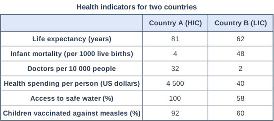
Figure 1 shows health indicators for an HIC and an LIC.
Using Figure 1, explain how uneven development leads to disparities in health.
Model answer
Figure 1 shows that uneven development leads to very large differences in health. Country A, an HIC, spends 4 500 US dollars per person on health, over 100 times more than Country B (40 US dollars). This means Country A can afford many more doctors (32 per 10 000 people compared with only 2, sixteen times as many), as well as hospitals, equipment and medicines.
In Country B, only 58% of people have access to safe water, so water-borne diseases such as cholera and diarrhoea are common, and only 60% of children are vaccinated against measles, compared with 92% in A. As a result, many children die from diseases that could be prevented or treated. This helps to explain why infant mortality is 12 times higher in B (48 compared with 4 per 1000) and why life expectancy is 19 years lower (62 compared with 81 years). Low incomes in LICs also mean many people cannot afford enough food or medicines, and tropical diseases such as malaria are common.
These health disparities also make uneven development worse, because sick people cannot work or study as well, which keeps incomes low in LICs.
Explanation
Link wealth to health spending, then to doctors, vaccinations and water, and finally to outcomes such as infant mortality and life expectancy. Manipulating the data (for example 16 times as many doctors) and noting that poor health in turn slows development are features of Level 3 answers.
Mark scheme
6 marks
Levels of response (6 marks). Level 3 (5-6 marks): detailed explanation with well-developed chains of reasoning linking differences in wealth to differences in health; makes effective use of evidence from Figure 1, including data comparisons and manipulation (e.g. how many times greater); may recognise that poor health also slows development. Level 2 (3-4 marks): clear explanation with some linked points and some use of data from Figure 1. Level 1 (1-2 marks): basic statements; data lifted with little explanation. 0 marks: nothing worthy of credit.
Indicative content (not a checklist; credit other valid points): Country A spends over 100 times more on health per person (4 500 v 40 US dollars), so it can afford more doctors, hospitals, equipment and medicines; Country A has 16 times as many doctors per 10 000 people (32 v 2); only 60% of children in Country B are vaccinated against measles compared with 92% in A, so more children die of preventable diseases; only 58% have safe water in B, so water-borne diseases such as cholera and diarrhoea are common; these factors help explain why infant mortality is 12 times higher in B (48 v 4 per 1000) and life expectancy is 19 years lower (62 v 81); in LICs low incomes also mean malnutrition and poor housing; tropical diseases such as malaria are common in many LICs; doctors may emigrate to HICs (brain drain); in HICs the main health problems are different, e.g. heart disease, cancer and obesity linked to ageing and lifestyle; poor health reduces productivity and keeps countries poor, widening the gap further.
Ready to try the rest? Every answer you write is marked against the mark scheme, so you can see exactly where the marks are.
Ctrl + Enter to check
AI TutorHints first, answers after you try
Hi! Stuck? Ask me for a hint and I’ll help you work it out. Once you’ve checked your answer I can explain exactly where the marks are.